Frontend System Design: Tooltip
Editable diagram: Open in Excalidraw
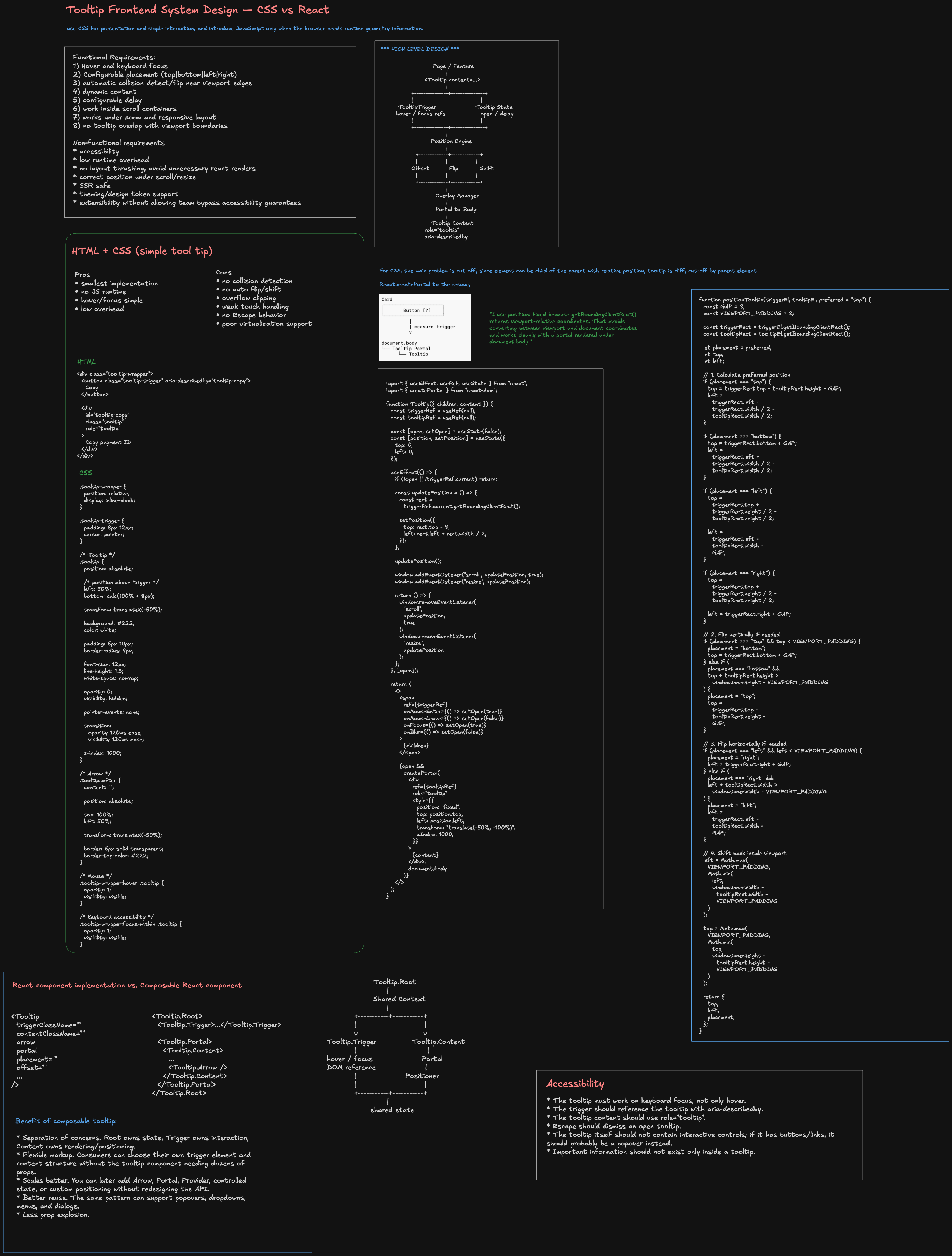
1. Problem Statement
Design a reusable tooltip system for a large web application.
The solution should support:
- Desktop and mobile
- Mouse, keyboard, and touch
- Placement: top / bottom / left / right
- Viewport collision handling
- Nested scroll containers
overflow: hidden- Large-scale usage such as DataGrid cells
- Accessibility
- Good rendering and runtime performance
- Reuse across many product teams
A good Staff-level framing is:
Start with the simplest primitive that satisfies the requirements, then introduce JavaScript only when runtime geometry or application state is necessary.
2. Requirements
Functional
- Show tooltip on hover
- Show tooltip on keyboard focus
- Support optional delay
- Support top / bottom / left / right placement
- Reposition on scroll / resize
- Flip when there is insufficient space
- Shift when partially outside the viewport
- Close when the trigger disappears
- Support mobile tap where appropriate
- Support controlled and uncontrolled usage
- Support design-system styling and theming
Non-functional
- Accessible by default
- Minimal DOM overhead
- Avoid unnecessary React rerenders
- Avoid layout thrashing
- SSR-safe
- Reusable across many products
- Easy to test
- Works in virtualized lists / tables
- Consistent z-index / overlay behavior
3. Two Implementation Levels
Option A — Pure HTML + CSS
Best for:
- Simple informational hints
- Local positioning
- No viewport-aware collision logic
- Small components
- Low complexity
<div class="tooltip-wrapper">
  <button class="tooltip-trigger" aria-describedby="tooltip-copy">
    Copy
  </button>

  <div id="tooltip-copy" class="tooltip" role="tooltip">
    Copy payment ID
  </div>
</div>
.tooltip-wrapper {
  position: relative;
  display: inline-block;
}

.tooltip {
  position: absolute;
  left: 50%;
  bottom: calc(100% + 8px);
  transform: translateX(-50%);

  padding: 6px 10px;
  border-radius: 4px;
  background: #222;
  color: #fff;

  font-size: 12px;
  line-height: 1.3;
  white-space: nowrap;

  opacity: 0;
  visibility: hidden;
  pointer-events: none;

  transition:
    opacity 120ms ease,
    visibility 120ms ease;

  z-index: 1000;
}

.tooltip-wrapper:hover .tooltip,
.tooltip-wrapper:focus-within .tooltip {
  opacity: 1;
  visibility: visible;
}
Advantages
- Small implementation
- No JavaScript bundle cost
- Browser handles hover/focus states
- Easy to understand
- Very low runtime overhead
Drawbacks
- No real viewport collision detection
- Cannot reliably flip from top to bottom
- Can be clipped by
overflow: hidden - No portal rendering
- Harder to support nested scrolling
- Weak touch/mobile interaction model
- No Escape-key behavior
- No shared-tooltip optimization for large tables
- Harder to coordinate virtualized triggers
- Limited delayed open/close state
4. Why CSS Can Be Cut Off
Card
┌────────────────────────────┐
│ overflow: hidden           │
│                            │
│        [ Button ]          │
│           ▲                │
│       Tooltip              │ ← clipped
└────────────────────────────┘
Even a high z-index does not escape overflow: hidden.
5. React Solution
Use:
- React state for open/close
- DOM refs for trigger and tooltip
getBoundingClientRect()for geometrycreatePortal()to escape clippingposition: fixedto use viewport-relative coordinates- Flip / shift logic
- Scroll / resize updates
Trigger
  ↓
Open tooltip
  ↓
Measure trigger
  ↓
Measure tooltip
  ↓
Calculate preferred position
  ↓
Collision?
  ├─ No → keep placement
  └─ Yes → flip
  ↓
Shift / clamp inside viewport
  ↓
Portal to document.body
  ↓
Render with position: fixed
6. Why createPortal
createPortal(
  <TooltipContent />,
  document.body
)
Without portal:
Card
└── Button
    └── Tooltip
        ↑ subject to parent's overflow / stacking context
With portal:
Card
└── Button

document.body
└── Tooltip
Benefits:
- Escape
overflow: hidden - Escape many stacking-context issues
- Centralize overlays
- Easier z-index management
- Useful for tooltip, popover, modal, dropdown, toast
Portal solves DOM placement, not geometry.
7. Why position: fixed
getBoundingClientRect() returns coordinates relative to the viewport.
That matches position: fixed.
const rect = trigger.getBoundingClientRect();
.tooltip {
  position: fixed;
}
getBoundingClientRect()
      ↓
viewport coordinates
      ↓
position: fixed
      ↓
same coordinate system
With position: absolute under document.body, you often need:
top = rect.bottom + window.scrollY;
left = rect.left + window.scrollX;
8. Positioning Logic
Core algorithm:
MEASURE
   ↓
PLACE
   ↓
FLIP
   ↓
SHIFT
   ↓
RENDER
function positionTooltip(
  triggerEl,
  tooltipEl,
  preferred = "top"
) {
  const GAP = 8;
  const PADDING = 8;

  const trigger =
    triggerEl.getBoundingClientRect();

  const tooltip =
    tooltipEl.getBoundingClientRect();

  let placement = preferred;

  function calculate(side) {
    switch (side) {
      case "top":
        return {
          top:
            trigger.top -
            tooltip.height -
            GAP,

          left:
            trigger.left +
            trigger.width / 2 -
            tooltip.width / 2,
        };

      case "bottom":
        return {
          top: trigger.bottom + GAP,

          left:
            trigger.left +
            trigger.width / 2 -
            tooltip.width / 2,
        };

      case "left":
        return {
          top:
            trigger.top +
            trigger.height / 2 -
            tooltip.height / 2,

          left:
            trigger.left -
            tooltip.width -
            GAP,
        };

      case "right":
        return {
          top:
            trigger.top +
            trigger.height / 2 -
            tooltip.height / 2,

          left: trigger.right + GAP,
        };
    }
  }

  let { top, left } = calculate(placement);

  if (
    placement === "top" &&
    top < PADDING
  ) {
    placement = "bottom";
    ({ top, left } = calculate(placement));
  }

  if (
    placement === "bottom" &&
    top + tooltip.height >
      window.innerHeight - PADDING
  ) {
    placement = "top";
    ({ top, left } = calculate(placement));
  }

  if (
    placement === "left" &&
    left < PADDING
  ) {
    placement = "right";
    ({ top, left } = calculate(placement));
  }

  if (
    placement === "right" &&
    left + tooltip.width >
      window.innerWidth - PADDING
  ) {
    placement = "left";
    ({ top, left } = calculate(placement));
  }

  left = Math.max(
    PADDING,
    Math.min(
      left,
      window.innerWidth -
        tooltip.width -
        PADDING
    )
  );

  top = Math.max(
    PADDING,
    Math.min(
      top,
      window.innerHeight -
        tooltip.height -
        PADDING
    )
  );

  return {
    top,
    left,
    placement,
  };
}
9. Positioning Diagram
           Tooltip
     ┌────────────────┐
     │                │
     └────────────────┘
              ↑
             GAP
              ↑
         ┌─────────┐
         │ Trigger │
         └─────────┘
top =
  trigger.top -
  tooltip.height -
  GAP;

left =
  trigger.left +
  trigger.width / 2 -
  tooltip.width / 2;
Decision flow:
Preferred = TOP
      ↓
Calculate TOP
      ↓
top < viewport padding?
   ┌───────┴────────┐
   │                │
  No               Yes
   │                │
Keep TOP       Try BOTTOM
                    ↓
              Bottom fits?
               ┌────┴────┐
               │         │
              Yes       No
               │         │
         Use BOTTOM    Clamp
10. React Component Architecture
Tooltip.Root
   |
   +-- shared state
   |
   +-- Tooltip.Trigger
   |      hover / focus / refs
   |
   +-- Tooltip.Content
          portal
          positioning
          role=tooltip
Recommended API:
<Tooltip.Root delay={300}>
  <Tooltip.Trigger>
    <button>Copy</button>
  </Tooltip.Trigger>

  <Tooltip.Content placement="top">
    Copy payment ID
  </Tooltip.Content>
</Tooltip.Root>
11. Why Composable Components
Benefits:
- Separation of concerns
- Avoids prop explosion
- Consumer controls markup
- Easy to add
Arrow,Portal, or custom content - Root owns shared behavior
- Trigger owns interaction
- Content owns rendering / positioning
- Easier to reuse infrastructure for popovers / menus
- Easier to enforce accessibility centrally
Composition gives consumers flexibility without exposing positioning or accessibility implementation details.
12. Data Model / State
type TooltipState = {
  open: boolean;
  placement:
    | "top"
    | "bottom"
    | "left"
    | "right";

  coordinates: {
    top: number;
    left: number;
  };
};
Keep this local rather than in Redux/global state because it is ephemeral, local, and potentially high-frequency.
13. Data Binding
Business data
     ↓
Tooltip content

Trigger DOM ref
     ↓
getBoundingClientRect()
     ↓
Positioning engine
     ↓
{top, left, placement}
     ↓
Tooltip.Content
14. Accessibility
Accessibility should be guaranteed by the design system.
Trigger:
<button
  aria-describedby={
    open ? tooltipId : undefined
  }
>
  Copy
</button>
Tooltip:
<div
  id={tooltipId}
  role="tooltip"
>
  Copies the payment identifier
</div>
Relationship:
Trigger
aria-describedby="tooltip-123"
        |
        v
Tooltip
id="tooltip-123"
role="tooltip"
Required interactions:
- Hover opens tooltip
- Keyboard focus opens tooltip
- Blur closes tooltip
- Escape closes tooltip
- Tooltip should not require mouse-only interaction
Important rule:
Tooltip content should be supplementary, not essential.
Tooltip vs Popover:
| Tooltip | Popover |
|---|---|
| Supplementary text | Rich content |
| Usually non-interactive | Interactive |
| Hover / focus | Click / explicit action |
role="tooltip" | Popover/dialog/menu semantics |
| Short-lived | Can stay open |
| No focusable controls | Can contain controls |
Reduced motion:
@media (prefers-reduced-motion: reduce) {
  .tooltip {
    transition: none;
  }
}
15. Mobile Design
Desktop:
hover / focus
   ↓
tooltip

Mobile:
tap explicit info icon
   ↓
open
   ↓
tap outside / second tap
   ↓
close
Recommended:
- Explicit info icon
- Large enough touch target
- Tap to open
- Tap outside to dismiss
- Recalculate placement after viewport changes
- Close or reposition on scroll
- Avoid long-press as the primary gesture
Content escalation:
short hint
  → tooltip

longer content
  → popover

interactive / large content
  → bottom sheet / modal
16. Rendering Strategy
Avoid 10,000 hidden tooltip nodes for a 10,000-row table.
Better:
{open &&
  createPortal(
    <Tooltip.Content />,
    document.body
  )
}
For dense UIs:
Cell A ─┐
Cell B ─┤
Cell C ─┤
Cell D ─┤
        ↓
Shared Tooltip Manager
        ↓
One tooltip DOM node
17. Performance
Main principle:
Do almost nothing while the tooltip is closed.
Closed:
No tooltip DOM
No scroll listener
No resize observer
No geometry measurement
No animation work
Open:
Mount one tooltip
Measure trigger/content
Attach only necessary listeners
Batch updates
On close:
Remove listeners
Cancel RAF
Remove tooltip DOM
Clear timers
Use RAF batching:
let rafId = null;

function scheduleUpdate() {
  if (rafId) return;

  rafId = requestAnimationFrame(() => {
    updatePosition();
    rafId = null;
  });
}
Avoid layout thrashing:
READ
trigger.getBoundingClientRect()
tooltip.getBoundingClientRect()

   ↓

CALCULATE

   ↓

WRITE
apply transform / top / left
For very frequent movement, direct DOM style updates may avoid repeated React renders:
tooltipRef.current.style.transform =
  `translate3d(${left}px, ${top}px, 0)`;
18. CSS vs React Comparison
| Topic | HTML + CSS | React + JS |
|---|---|---|
| Hover | Excellent | Excellent |
| Keyboard focus | Good | Excellent |
| Bundle/runtime cost | Lowest | Higher |
| Viewport collision | Weak | Strong |
| Auto flip | No | Yes |
overflow: hidden escape | No | Yes via portal |
| Nested scrolling | Fragile | Stronger |
| Escape key | No | Yes |
| Touch behavior | Weak | Configurable |
| Virtualized list support | Weak | Strong |
| Shared tooltip host | Difficult | Easy |
| Large design-system extensibility | Limited | Strong |
| Dynamic placement | Weak | Strong |
19. When to Choose Each
Choose CSS-only when:
- Tooltip is simple
- Parent clipping is controlled
- Fixed placement is acceptable
- Desktop-first surface
- No touch-specific requirement
- No dynamic positioning
Choose React + JS when:
- Design-system primitive
- Nested scroll areas
- Viewport-edge placement
- DataGrids / virtualized surfaces
- Portal required
- Mobile support required
- Controlled state required
- Shared overlay infrastructure is valuable
20. Overlay / Z-Index Architecture
Avoid random values like:
z-index: 99999999;
Prefer design-system layers:
base          0
sticky       100
dropdown     200
popover      300
tooltip      400
modal        500
toast        600
Long-term:
Tooltip
Popover
Dropdown
Modal
Toast
   ↓
Overlay Manager
   ↓
Portal roots + stacking policy
21. Edge Cases
Trigger unmounts
tooltip open
   ↓
user scrolls
   ↓
virtualized trigger unmounts
   ↓
close tooltip
Viewport edge
Use flip, shift, clamp.
Nested scroll container
Recalculate position on ancestor scroll.
Orientation change
Recalculate on resize.
Browser zoom
Use real DOM measurements.
Mobile keyboard
The visual viewport can shrink. Consider a popover or bottom sheet for longer-form help.
22. Staff-Level Architecture
                         Application
                              |
                      Tooltip primitive
                              |
          +-------------------+-------------------+
          |                   |                   |
       Trigger            State machine       Content
          |                   |                   |
  hover/focus/tap      delay/open/close       portal
          |                   |                   |
          +-------------------+-------------------+
                              |
                      Positioning engine
                              |
                +-------------+-------------+
                |             |             |
              Offset         Flip          Shift
                |             |             |
                +-------------+-------------+
                              |
                       Overlay Manager
                              |
                       document.body
This can later be shared with:
- Popover
- Dropdown
- Menu
- Select
- Date picker
23. Testing
Unit:
- top / bottom / left / right placement
- flip
- shift
- clamp
- delay logic
Component:
mouseenter → opens
mouseleave → closes
focus → opens
blur → closes
Escape → closes
Accessibility:
aria-describedbyrole="tooltip"- Keyboard access
- Screen-reader description
- Reduced-motion behavior
Visual regression:
- All placements
- Every viewport edge
- Nested scroll container
- Dark mode
- 200% zoom
- Mobile viewport
- Long tooltip content
24. Interview Summary
I would start with CSS when the requirements are only hover, focus, and fixed placement. Once we need viewport-aware collision handling, nested scrolling, portal rendering, touch behavior, or large-scale reuse, I would move to a React/JavaScript solution.
In React, the tooltip should separate interaction state, positioning, and rendering. The trigger owns hover/focus behavior and a DOM ref. The positioning engine reads the trigger and tooltip bounds, applies offset, flip, and shift, and returns viewport-relative coordinates. The content is rendered through
createPortalunderdocument.bodyusingposition: fixedto escape clipping.For accessibility, the trigger uses
aria-describedby, the content usesrole="tooltip", keyboard focus must provide the same information as hover, and Escape should dismiss the tooltip. Interactive content should use a popover instead.For performance, I would lazy-mount tooltip content, attach listeners only while open, batch geometry updates with
requestAnimationFrame, separate DOM reads from writes, and use a shared tooltip host for dense surfaces like DataGrids.